


Different ways of counting COVID-19 deaths in England and Wales


There are three different metrics for the number of weekly deaths from COVID-19 in England and Wales: first, the number of deaths within 28 days of a positive test; second, the number of deaths with COVID-19 on the death certificate; and third, excess deaths (the number of deaths in excess of the average over the last five years). The first two metrics can be obtained from the government’s COVID-19 dashboard; the third can be obtained from the ONS.
The chart below plots the three measures from week 10 to week 53 of 2020. (I have not adjusted excess deaths to take account of population ageing.) All three lines rise dramatically during the first wave, and then rise more slowly during the second wave. Interestingly, excess deaths is much higher than the other two measures in the first wave, but is somewhat lower in the second. This suggests that there were many false negatives in the first wave, and that there may have been some false positives in the second.
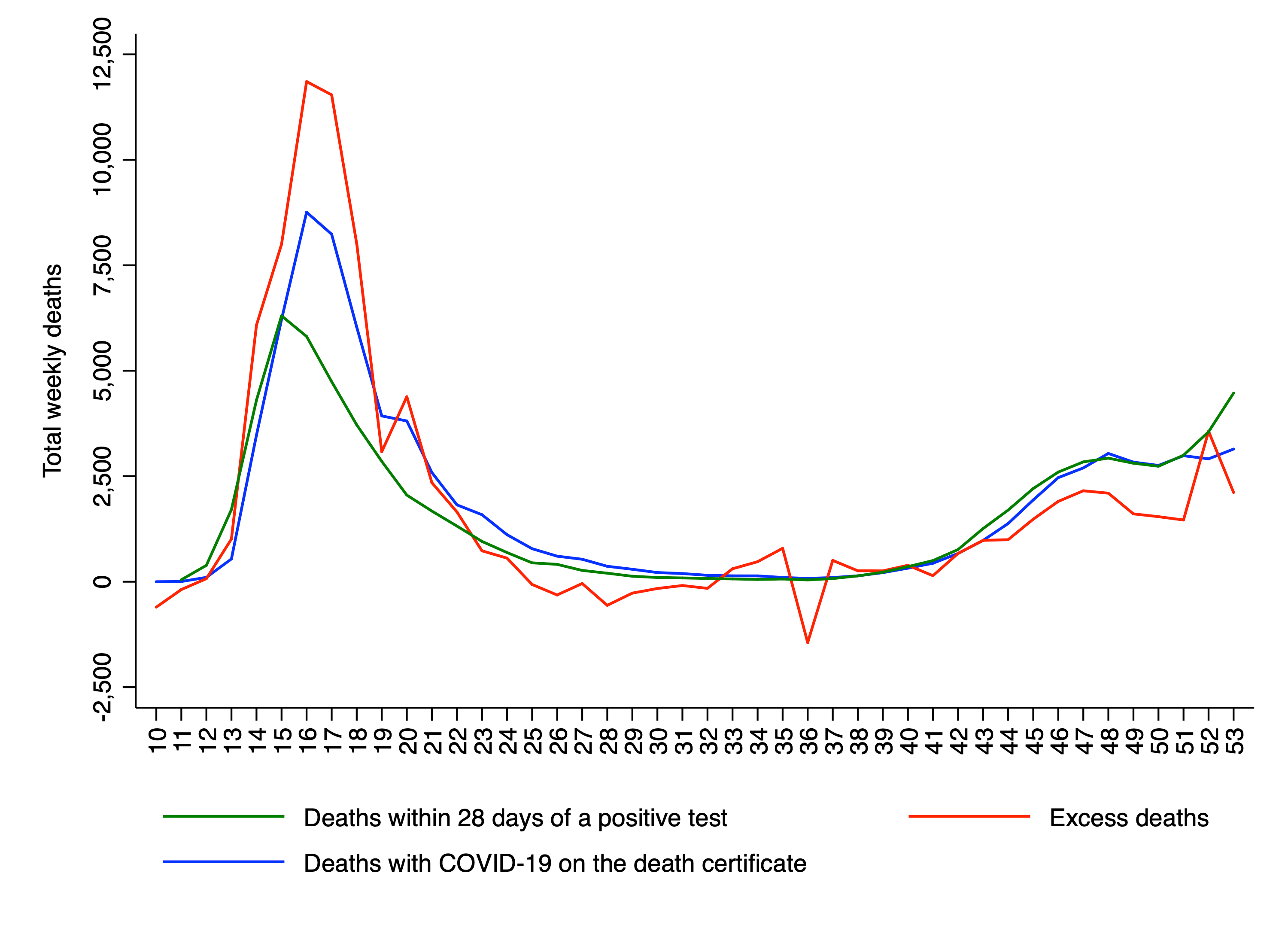
The most likely reason for false negatives in the first wave is that comparatively few people were being tested. As to why there have been false positives in the second wave, one possibility is that people who died of other causes were assumed to have died of COVID-19 because they recently tested positive for the virus.
The three metrics were approximately equal in week 40, which is useful place to start counting. In the remaining 14 weeks of the year, there were: 31,720 deaths according to the green line; 28,559 deaths according to the blue line; and 21,111 deaths according to the red line. If we assume that the red line is most accurate, the green line overestimated deaths by 50%, and the blue line overestimated deaths by 35%.
Of course, the second wave of the pandemic is still ongoing, and all three metrics may increase further during the month of January. It will be interesting to see whether the pattern observed in the last part of 2020 continues into the new year, or whether excess deaths rises above the other two metrics, as it did in the first wave.
Image: John Glover, Ullswater early morning, 1824
Thanks for reading. If you found this newsletter useful, please share it with your friends. And please consider subscribing if you haven’t done so already.