Is global poverty about to start rising?
One of the most widely shared charts of recent years is the one showing a decline in the percentage of the world’s population living in absolute poverty. Below is the version put together by the good people at Our World in Data. According to the chart, about 90% of people lived on less than $1.90 per day in 1820, compared to only 10% by 2015.
This chart was the centrepiece of Steve Pinker’s Enlightenment Now, which argues that things are generally getting better, thanks to the European Enlightenment. In a piece for the Wall Street Journal promoting that book, Pinker wrote, “In 1988, the world had just 45 democracies, embracing two billion people; today it has 103, embracing 4.1 billion. That year saw 46 oil spills; 2016, just five. And 37% of the population lived in extreme poverty, barely able to feed themselves, compared with 9.6% today.”
The chart is frequently shared by libertarians and pro-market types, who like to say things like “Thank you, free-market capitalism!” (I presume they’re saying this while enthusiastically firing their legally registered handguns into the air.) The chart has even been shared by the world’s greatest philanthropist (or vaccine-peddling evil genius, depending on your perspective): Bill Gates. A lot of educated people, or at least data nerds who frequent Twitter and read publications like The Economist, now take for granted that – whatever else may be wrong in the world – we’ve at least brought most people out of extreme poverty.
However, the chart has not gone uncriticised. One of its main detractors is the left-wing anthropologist Jason Hickel (although I assumed he was a fashion model). Hickel believes the chart is deficient on a number of counts: the $1.90 threshold is too low; we should focus on the absolute number, not the percentage; some of the early data are a bit sketchy; the chart “erases the toll of colonialism”; and “virtually all” the decline since 1980 occurred in a single country, China. Some of these points are quite reasonable, but for the sake of argument, I’ll assume the chart is approximately correct. (Here’s a critique of Hickel by the economist Noah Smith.)
I want to raise a different question, namely: is global poverty about to start rising? I’m not talking about the temporary rise in global poverty caused by the COVID pandemic, and more specifically by lockdowns. (The World Bank estimates that about 100 million people fell into extreme poverty last year, taking us back to where we were in mid 2015.) No, I’m talking about a longer-term rise in poverty that may result from differential fertility rates in the poor versus rich parts of the world.
Consider the chart below, which shows the percentage of people living in absolute poverty by world region. Since the mid 1990s, the poverty rate has come down in all regions, though by least in Sub-Saharan Africa. As of 2015, less than 20% of South Asians, and less than 10% of other non-Africans, lived in extreme poverty. By contrast, 40% of Sub-Saharans still lived in extreme poverty. What’s more, the rate of poverty reduction in Sub-Saharan Africa appears to have slowed since 2005. For example, it took Sub-Saharan Africa ten years to go from 50% to 40%, but took East Asia only five years to go from 40% to 20%.
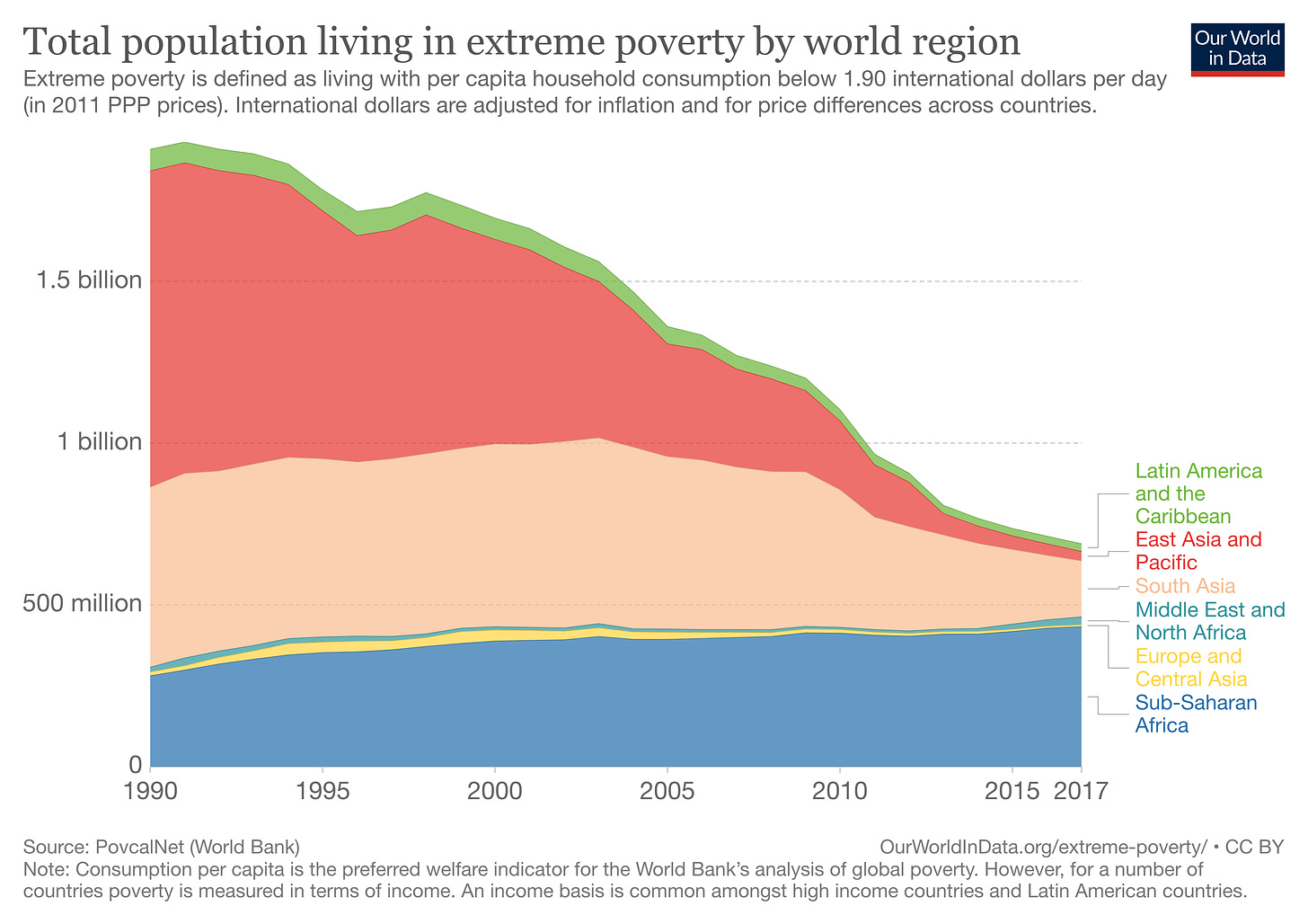
Here’s another chart, showing the number of people living in absolute poverty by world region. It indicates that the percentage of extremely poor people living Sub-Saharan Africa has steadily increased over the last thirty years. Back in 1990, less than 20% of extremely poor people lived in Sub-Saharan Africa (at that time, the lion’s share were actually in East Asia). Now more than 50% live in Sub-Saharan Africa, with the rest being mainly in South Asia.
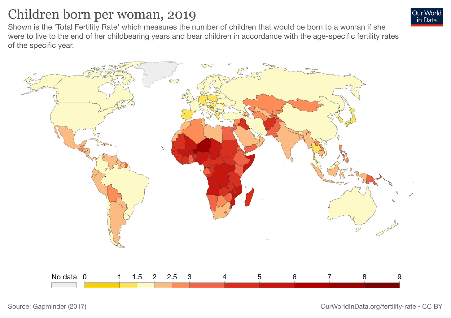
Now consider a map of the world by total fertility rate. Practically all the countries with the highest fertility rates are in Sub-Saharan Africa (presumably in part because that’s where the poverty is, and economic development tends to lower fertility rates). Most of Eurasia, America and Australasia has a fertility rate of less than 2.5 children per woman. By contrast, most of Sub-Saharan Africa has fertility rate of more than 3 children per woman. And some African countries are in the fives and sixes.
Circa 2020, we can therefore divide the world into two broad regions: Sub-Saharan Africa and the rest. In Sub-Saharan Africa, 40% of people live in absolute poverty and the average fertility rate is around 4.5. In the rest of the world, less than 10% of people live in absolute poverty and the average fertility rate is around 2.
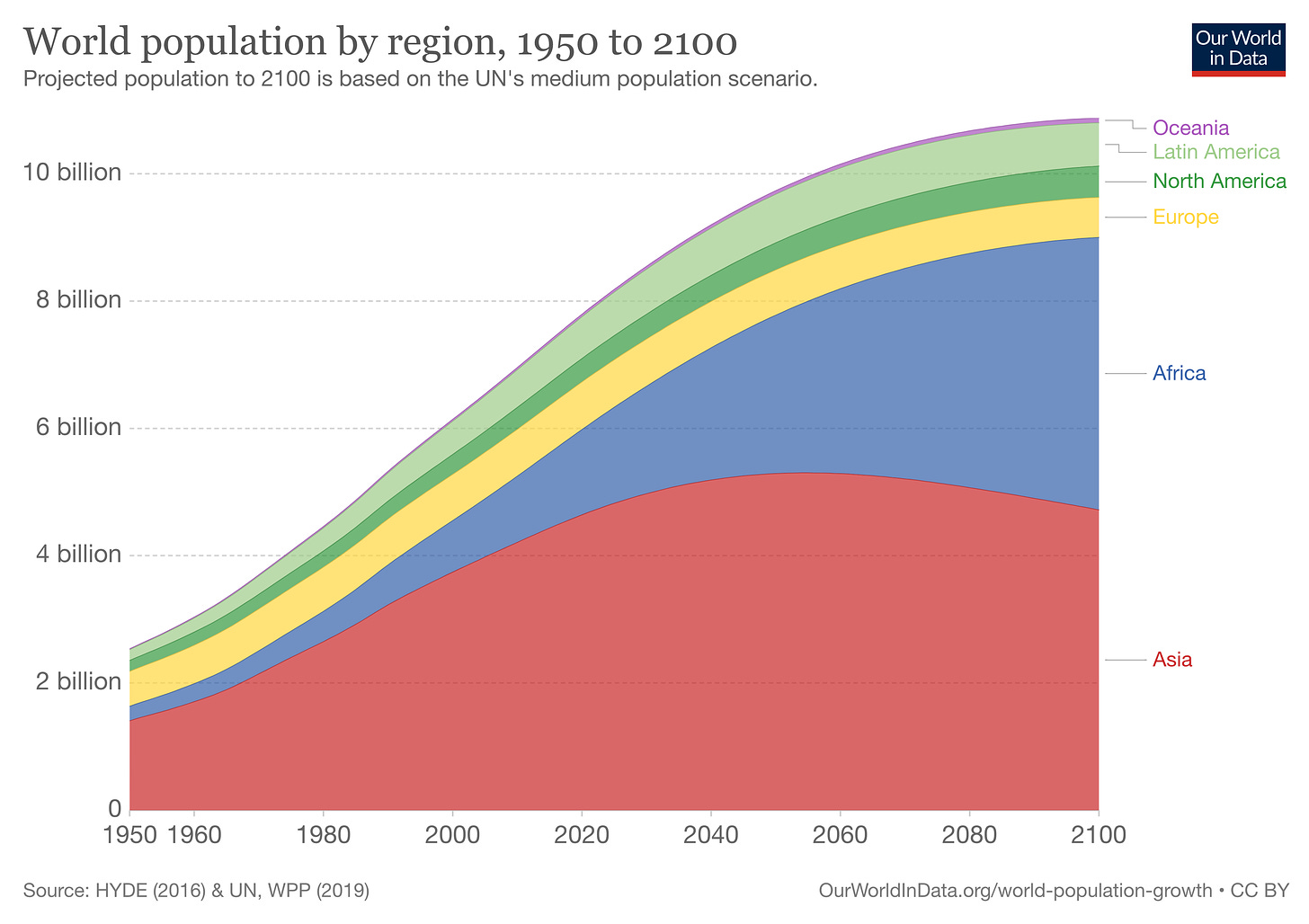
The final chart shows UN population projections up to 2100 by world region. As of 2020, the majority of the world’s population is still in Asia. However, that is set to change over the coming decades (with the proviso that long-term population projections are always uncertain). While other regions of the world will either remain small or even shrink, Africa’s population will explode, rising from approximately 1 billion in 2020 to over 2 billion by 2050. Steve Sailer has dubbed this “The World’s Most Important Graph”.
Let’s begin by assuming that Sub-Saharan Africa’s poverty rate remains fixed at 40%, while the poverty rate in the rest of the world remains fixed at 5%. (Weighting by population, this gives us the 10% figure for 2015 shown in the first graph.) And for the sake of simplicity, let’s treat Sub-Saharan Africa and Africa as equivalent. By 2050, Africa is expected to comprise 26% of the global population, compared to 17% today. Under these assumptions, the global poverty rate will rise to 14% in 2050 – up from 11% today.
Now, this figure of 14% is almost certainly an upper-bound, given that we assumed neither Africa nor the rest of the world will make any further progress in reducing poverty. This assumption seems rather unrealistic. Although Europe, North America and East Asia have basically reached the floor of poverty reduction, there’s still scope for poverty to come down in other world regions, particularly Africa. On the other hand, assuming constancy of Africa’s poverty rate may not be too unrealistic, given that it’s presumably harder to reduce poverty in a rapidly growing population.
Nonetheless, suppose the poverty rate in Africa falls to 30%, while the poverty rate in the rest of the world falls to 3.5%. In that case, the global poverty rate will decline to 10.4% in 2050, which is 0.6 percentage points lower than it is today. And if we use the figures of 25% and 3% as the end-points instead, then the global poverty rate will drop below 9%.
These are of course highly simplified, back-of-the-envelope calculations. But they give a general sense of what might happen over the next few decades. While a rise in the global poverty rate up to 14% is somewhat implausible, it seems unlikely the rapid decline of the past few decades will continue. The most likely scenario, in the end, may be that the poverty rate remains stable at around 10%. This is assuming, of course, that there is no sudden change in the pattern of fertility, which would scupper the UN’s population projections.
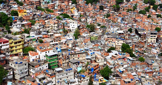
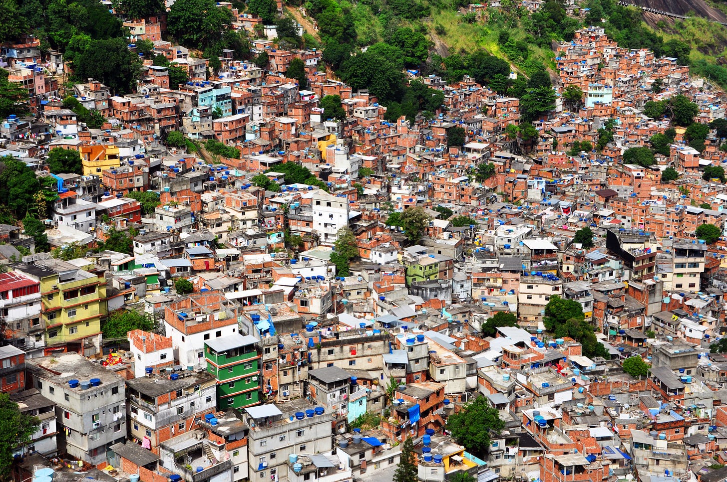
Image: Rocinha favela, Rio de Janeiro, 2010
The Daily Sceptic
I’ve written five more posts since last time. The first notes that England’s age-standardised mortality rate came in below the five-year average for the fourth consecutive month. The second asks whether the government has been undermining social norms by imposing inconvenient rules it can’t enforce. The third asks whether lockdown was illegal. The fourth notes that hospitalisations and deaths can increase simply due to higher transmission. The fifth notes that Google mobility data suggest Freedom Day will not cause a rebound in cases.
Thanks for reading. If you found this newsletter useful, please share it with your friends. And please consider subscribing if you haven’t done so already.

