How many excess deaths were there in the UK last year?
Last week, I wrote a piece for The Critic arguing that the figure of “100,000 deaths” (the number of British people who are said to have died from COVID-19 up to 17 January) is slightly misleading. My arguments were twofold: first, the figure is probably an overestimate; and second, it represents the change in mortality, not the current level. Here I want to respond to a couple of points that were raised after my article was published.
In the piece, I noted that – although 2020 saw the largest number of excess deaths since the 1940s – the age-standardised mortality rate “only” fell back to the level of 2008. One critic argued this is “like pointing out that a 10% recession only puts us back to where GDP was in 2006”. However, my point was that we should consider both the change and the level. There’s no doubt that the UK saw a dramatic increase in mortality last year. Yet despite this increase, its life expectancy was still higher than the life expectancy of most other countries around the world in 2018.
This fact was acknowledged in a report published by the UK’s Office’s for National Statistics (ONS) in July of last year. The report noted that “the highest mortality rate observed during a “normal” winter in Bulgaria has historically been greater than the highest mortality rate observed during the “abnormal” coronavirus pandemic in England.” And in a recent blog post dealing with last year’s rise in deaths, the Head of Mortality Analysis at the ONS said, “for the best comparisons, we really need to look at age-standardised mortality rates”.
To focus only on the change, and not at all on the level, would lead one to conclude that 1919 was the least deadly year in British history, since it saw an increase in life expectancy of 13 years. Yet life expectancy at the time was only 54. We should be very concerned about the number of deaths last year (which – as I’ve noted – tells us something about COVID-19’s lethality conditional on all the measures we’ve taken). But we should also have a sense of perspective.
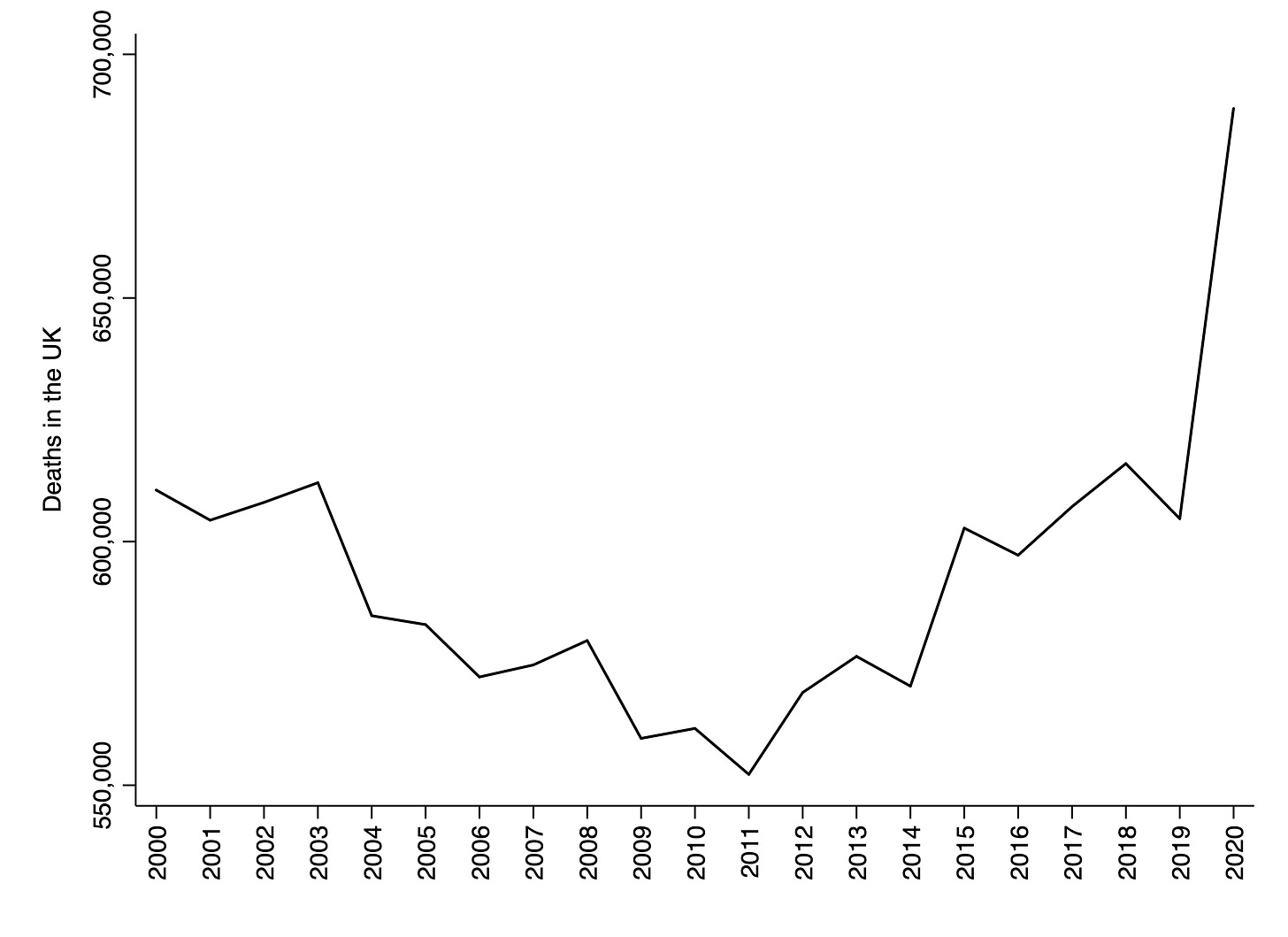
A second issue raised after the publication of my article was that I did not say by how much “100,000 excess deaths” overestimates the true figure. I will address that now. The chart below shows the number of deaths in the UK each year between 2000 and 2020. I have purposefully truncated the y-axis to make the pattern clearer. Deaths fell between 2000 and 2010, and then rose between 2011 and 2019. 2020 – the year of the pandemic – obviously represents a spike in the series.
Why did deaths fall and then rise again? This was due to the changing magnitude of two trends: population ageing (the increase in the number of people in the oldest age-groups) and the reduction in age-specific mortality rates. Between 2000 and 2010, the rate of population ageing was relatively low, and the rate of reduction in age-specific mortality rates was relatively high. Between 2011 and 2019, the rate of population ageing was relatively high, and the rate of reduction in age-specific mortality rates was relatively low.
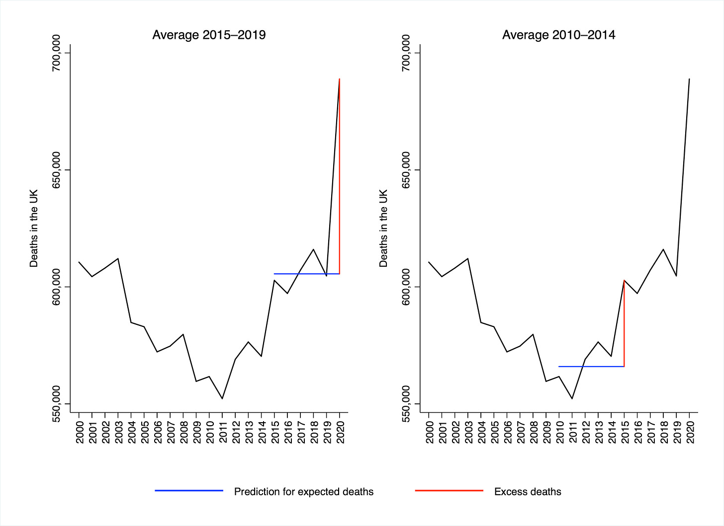
Now consider how we should compute excess deaths from these data. The most common method is to take the number of deaths in 2020 and subtract the average of the last five years. However, since the population is ageing, using a five-year average may underestimate the number of deaths one would expect to see in 2020. (This point was made in an article by Carl Heneghan and Jason Oke in June of last year.) Performing the normal calculation for 2020 yields a total of 83,294 excess deaths. Since the five-year average is equal to 605,576 deaths, excess mortality comes out as 13.8%.
To see why this number is probably an overestimate, look at the year 2015. The number of deaths was high relative to previous years. If we use the average of the last five years for the number of expected deaths, and then subtract this from the number of deaths in 2015, we find that there were 36,838 excess deaths – corresponding to excess mortality of 6.5%. Yet there was no pandemic in 2015.
These calculations are visualised in the figure below. The blue line on each chart corresponds to the prediction for expected deaths, and the red line corresponds to the resulting value of excess deaths. Given population ageing, a more realistic estimate of expected deaths in 2015 is a number somewhat larger than the total for 2014.
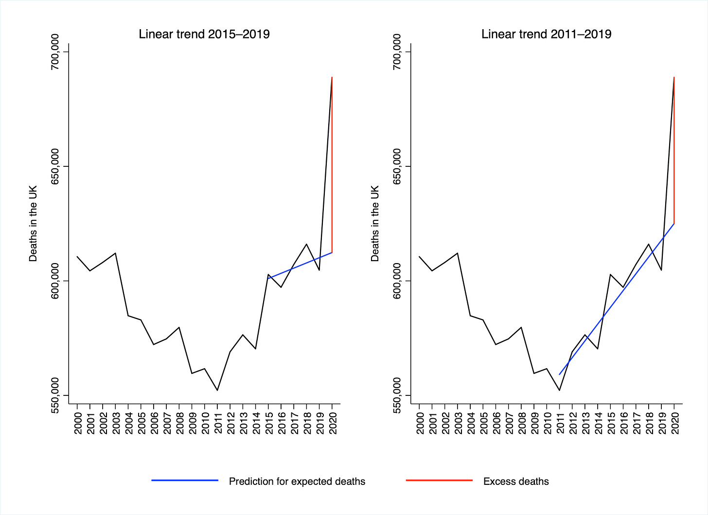
The best way of estimating expected deaths in 2020 would be to apply the projected age-specific mortality rates to the projected population age-structure. Aside from that, there are only more or less sensible ways of taking into account the information in the chart above. Rather than using an average of the last five years, it is arguably more sensible to use a trend.
The figure below shows the calculations corresponding to two linear trends: the left-hand chart shows a trend from 2015 to 2019, while the right-hand chart shows a trend from 2011 to 2019. When using a five-year trend (as on the left), excess deaths comes out as 76,496 – 8.2% smaller than when using a five-year average. And when using a nine-year trend (as on the right), excess deaths comes out as 63,836 – 23.4% smaller than when using a five-year average.
If we assume that the degree of overestimation remains the same in the first three weeks of 2021, then total excess deaths up to 17 January would be: 91,800 when using a five-year trend, and 76,600 when using a nine-year trend. There are two things to say about these estimates. First, they are both still very large numbers. And second, I’m not claiming either one is the correct figure, since a linear trend might not be the best way to estimate expected deaths. What I am saying is that “100,000 excess deaths” is probably an overestimate.
As before, none of what I’ve said is meant to trivialise the pandemic. I’ve already noted that last year saw the largest fall in life expectancy since 1940 – a very significant event. But we should try to be as accurate as possible when discussing COVID-19’s lethality, and I’m not sure that “100,000 excess deaths” (up to 17 January) is the most accurate figure we can come up with.
Image: Gustave Doré, Landscape in Scotland, 1878
Thanks for reading. If you found this newsletter useful, please share it with your friends. And please consider subscribing if you haven’t done so already.


