COVID-19 death rate and the size of the elderly population
In a previous newsletter, I analysed rich countries’ responses to the COVID-19 pandemic. The sample comprised countries with population >100,000 and GDP per capita >$25,000. I reported that, of the 15 that managed to contain the virus up to 15 December, 13 were either East Asian countries, ultra-rich countries with authoritarian governments, or geographically peripheral Western countries. (Containment meant having reported less than 100 COVID-19 deaths per million people.)
To check whether the size of the elderly population might help to explain differences in COVID-19 mortality within this sample of rich countries, I examined the relationship between COVID-19 deaths per million people (up to 31 December) and the fraction of the population aged 65+. (Both measures were taken from Our World in Data’s database.) The scatterplot is shown below.
While there is variation in COVID-19 death rate at all levels of the x-axis variable, it can be seen that no country with an elderly population of less than 10% has a high COVID-19 death rate. (Note that this would not be true if the sample were expanded to include poorer countries in Latin America, some of which have reported high COVID-19 death rates, despite having somewhat younger populations. In Brazil, for example, 8.6% of the population is older than 65.)
Can the size of the elderly population help to explain why some rich countries have been more “successful” than others? The three “successful” countries I described earlier as “ultra-rich countries with authoritarian governments” were Brunei, UAE and Qatar. All have reported less than 100 COVID-19 deaths per million people, as of 31 December. And all have small elderly populations. Brunei’s is 4.6% of the total, UAE’s is 1.1% and Qatar’s is 1.3%.
Rather than describing these three as “ultra-rich countries with authoritarian governments”, it might have been more pertinent to describe them as “countries with small elderly populations”. If we look only at rich countries with elderly populations of more than 10%, just nine have kept deaths below 100 per million people: Taiwan, Singapore, New Zealand, South Korea, Japan, Australia, Norway, Iceland, and Trinidad and Tobago. Four are East Asian countries; four are geographically peripheral Western countries; and one is an island.
Image: Axel Fahlcrantz, Himmel och vatten
The second wave in England and Wales
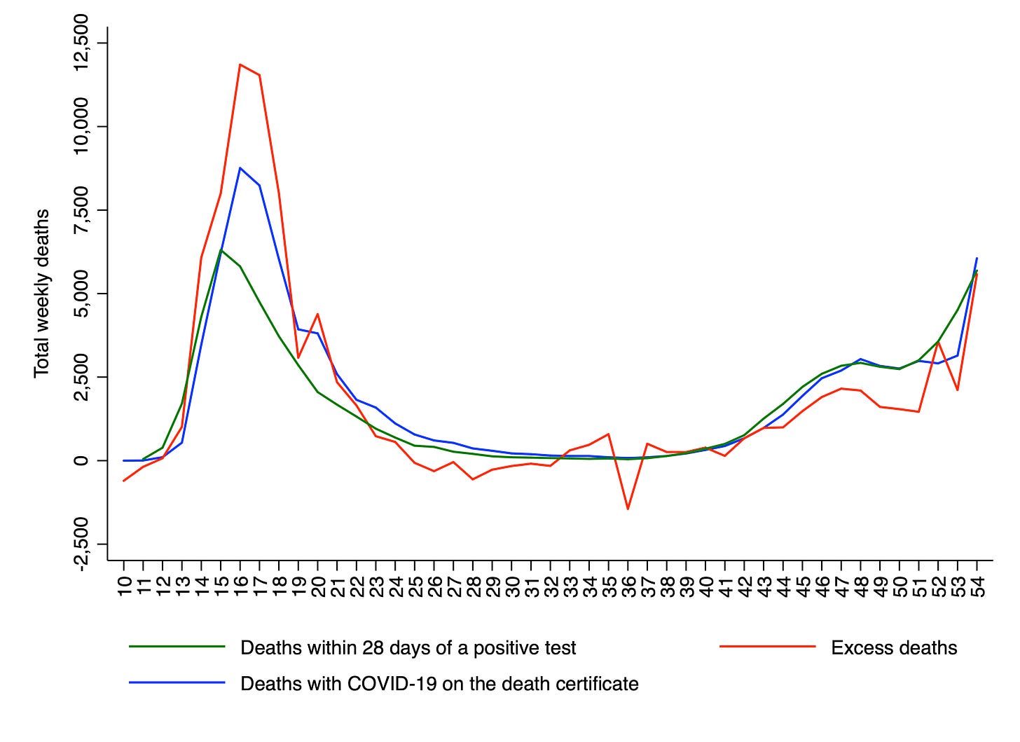
In my last newsletter, I noted that there are three different metrics for the number of weekly deaths from COVID-19 in England and Wales, and that since the beginning of the second wave, excess deaths has been running lower than the other two. (Interestingly, David Spiegelhalter – who is Professor of the Public Understanding of Risk at Cambridge University – made the same observation in his Guardian column.)
The latest weekly data were published by the ONS on Tuesday, and there was a sharp uptick in both excess deaths and deaths with COVID-19 on the death certificate. This is shown in the chart below. What I have called “week 54” corresponds to the first week of 2021. As can be seen, both the red and blue lines rise abruptly.
However, the latest numbers came with a health warning from the ONS: “Delays with registering deaths over the Christmas and New Year period may account for the higher number of registered deaths in Week 1 of 2021”. As Professor Spiegelhalter noted in a tweet, deaths always increase sharply in the first week of the year. And they almost always fall in the second or third week too (see the chart he posted).
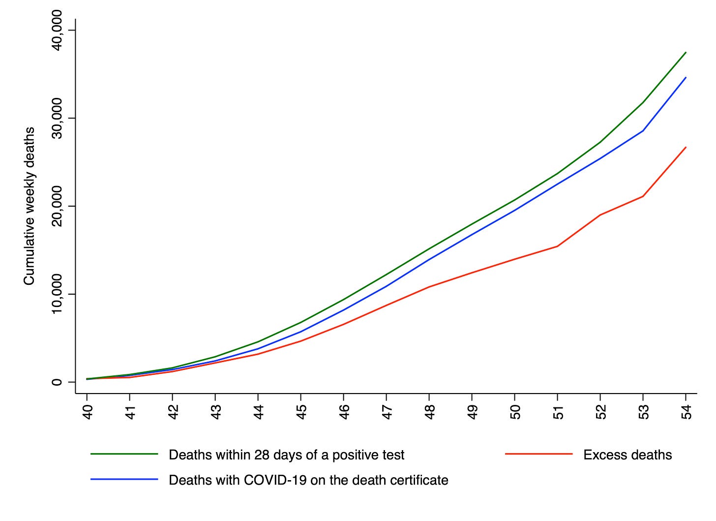
To what extent have these belatedly registered deaths reduced the gap between excess deaths and the other two metrics? We can check this by plotting the cumulative number of weekly deaths since week 40, separately for the three metrics. As shown in the chart below, there is still a sizeable gap between the red line and the other two lines. In fact, the green line is 40% higher, and the blue line is 30% higher.
It will be very interesting to see the numbers published next week. If they are higher than this week’s numbers, that will constitute evidence that mortality in the second wave is accelerating upwards, like it did in the first wave. By contrast, if they are lower than this week’s numbers, that will constitute evidence that the second wave has been substantially less than lethal than the first.
Excess mortality in 2020
The ONS recently published the age-standardised mortality rates in England and Wales for all 12 months of 2020. The value for England came out as 1,037. This is 8.5% higher than the average over the last five years, which means that last year saw excess mortality of 8.5%. Other figures you may have seen quoted, based on excess deaths, do not take account of population ageing.
Thanks for reading. If you found this newsletter useful, please share it with your friends. And please consider subscribing if you haven’t done so already.


